
5 UX Writing Practices that Delight Me
Delightful is a word that comes up a lot in the context of UX and UX writing. As UX professionals, we often aim to delight our users.
In that spirit, today I’m sharing five UX writing practices that *I* find delightful when I encounter them in a product:
1. Sentence case capitalization
Title case capitalization (i.e., capitalizing the first letter of every word) is a pretty uniquely American English thing that often carries over into product copy. Designers tend to like title-case capitalization because it makes a string of text look more symmetrical and aesthetically pleasing.
If you follow me on LinkedIn (shameless plug), you probably know by now that I’m not a fan of title-case capitalization in UX copy. Instead, I prefer sentence case (i.e., only capitalizing the first letter of a text string or phrase, like in a sentence).
Here’s why:
Consistency – It’s super easy to be consistent with sentence case. The rule is clear: Capitalize the first letter of a sentence or phrase and nothing else (except for proper nouns, no matter where they are). Unlike title-case capitalization, there’s no question about whether or not articles (a, an, the) should be capitalized (no, unless they’re the first word of the string) and no debating about whether title case should be used in all elements/levels (e.g., H1, H2, buttons, placeholders, etc.) or just some of them.
Localization prep – Most languages that use the Latin alphabet don’t use title-case capitalization. It’s not common to capitalize words in the middle of a sentence in Romance languages like Spanish or Portuguese. In German, in contrast, nouns are capitalized, no matter where they are in the sentence.
By using sentence case in English (especially choosing it as your settings in Figma, for example), it sets a better foundation for localizers, whereby they can simply follow their own language’s capitalization rules, as opposed to having to consider and deal with this “peculiar” English form of capitalization.
Space – Capital letters take up more space. Space, of course, isn’t everything, but in UX writing, we’re often working with limited real estate, so being able to shrink things down a little bit, by mostly using the letters’ smaller versions, can make a difference. (Side note to illustrate the impact of just a few pixels: In college, one of my professors explicitly warned us that we would get in trouble if we made all the punctuation in our term papers size 20 font to take up more space and thus make the paper the right length. Don’t believe it? Try it out by searching for all the periods in a document and increasing their font size. 😀)
2. Forms without placeholders
The use of placeholders (usually light text within a field) is mostly a product of the mobile design era, where putting the label within, instead of above, a field could save a lot of space, especially for long forms, which would require a lot of scrolling on mobile devices.
But who among us hasn’t had to clear out a form field after we’ve started typing so that we can see what we were supposed to include in that form? This usually happens in open-ended text fields where you’re supposed to share examples, background, or other details about yourself or what you’re looking for—anything a little more involved than just your first name or email address.
The experts at Nielsen Norman Group don’t mince words when they say: “Placeholders in form fields are harmful.”
Placeholders can:
Be easily missed, especially by users with low visibility or those using screen readers
Make a field look full when it’s not, causing users to skip over it and then get an error message
Cause users to forget what they’re supposed to enter after they’ve started typing (because the placeholder with the instructions has disappeared)
In short, I like my form labels dark, clear, and easily accessible when I’m trying to fill out a form.
3. Not using “my” and “your” in feature names
Remember “My Computer” on Windows back in the 1990s? It helped you understand which files were yours. But by Windows 8, Microsoft had changed it to “This PC”—a great improvement, if you ask me.
The goal of “my” and “your” is customization. Using “my,” in particular, is sometimes talked about as a way to help users feel like the product is an extension of them. YouTube has a tab called “Your videos,” which takes you to your “channel,” where you can upload videos and create playlists. If they called that “Videos,” it wouldn’t work because, well, all of YouTube is videos.

In my (ha) opinion, these possessive pronouns can quickly make the UX copy messy and confusing.
Take this example from Canva, which evidently has a new feature called “Your Story”:
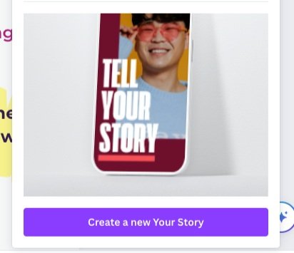
When they tack the pronoun onto it, the button becomes “Create a new Your Story.” Oy vey. Here it seems like “Story” would have sufficed. In other cases, “Saved” or “Uploaded” (e.g., “Saved videos”) does the job.
3. Confirmation pop-ups that start with a verb
When a user’s about to perform an action that has serious consequences or is irreversible, we typically ask them to confirm the action. But too many confirmation pop-ups/modals start with “Are you sure you want to…” Here’s why I don’t like that format for these types of messages:
It assumes that users aren’t sure, which can feel patronizing and annoying.
It’s longer than necessary.
It’s hard to scan because the actual message is hidden in the middle of the string.
Instead, I prefer confirmation pop-ups that get right to the heart of the message:
Delete this file?
This can’t be undone.
[Cancel] [Delete]
Or a favorite from Slack:

5. Copy that doesn’t seem like it’s trying too hard
I like playfulness. I like so-called Easter eggs, especially in empty states or success messages. But I don’t think every product should be playful or witty (as I’ve written before), and I don’t have patience for copy that seems like it’s trying too hard. What does “trying too hard” mean? It’s subjective, of course. One example that I always remember was the product that said, “Looking good today!” when I uploaded a profile picture. C’mon—the product couldn’t actually see me, and what if I had uploaded something horrible or gross instead? It still would have given me that silly little platitude.
Looking to work with UX writers who will write delightful UX copy for everyone involved? Get in touch!